Stay Home
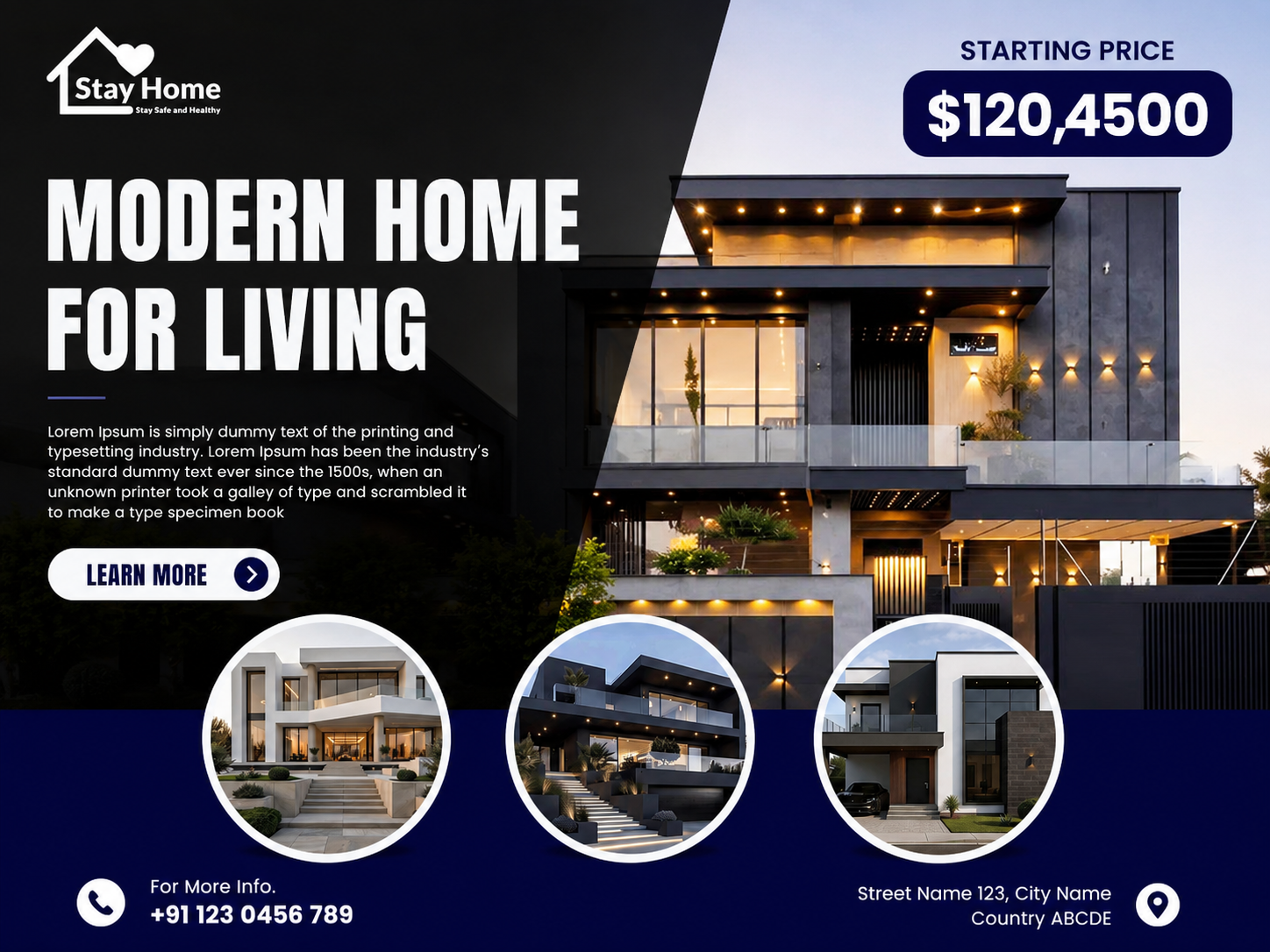
A modern real estate marketing creative designed to present contemporary homes through premium imagery, clear property messaging, and conversion-focused visual hierarchy.
- Real Estate
- Digital Advertising
- Marketing
Overview
Problem
Research
- Explored visual approaches used in modern residential property advertising
- Studied how architectural imagery can be combined with promotional messaging
- Explored information hierarchy for pricing, property previews, and contact details
- Tested dark and light contrast combinations to create a premium real estate aesthetic
Design process
- 01
Visual Direction
Established a premium and contemporary visual direction using dark tones, architectural photography, and high-contrast typography.
- 02
Composition
Structured the layout around the main property image, using an angled dark overlay to create a strong separation between imagery and information.
- 03
Information Hierarchy
Prioritised the property headline and starting price while keeping supporting copy, property previews, and contact information easy to scan.
- 04
Final Creative
Refined the property imagery, typography, CTA, pricing badge, circular property previews, and contact details into a cohesive marketing composition.
Wireframes
Colour system
Midnight Navy
#080746
Charcoal
#171717
Pure White
#FFFFFF
Cool Grey
#E8E8EE
Typography
- Display
Bold Condensed Sans Serif
Strong uppercase typography used for the main property headline and visual impact
- Body
Clean Sans Serif
Readable typography for supporting property information and descriptions
- Labels
Bold Sans Serif
Used for pricing, CTA labels, and key property information
UI components
- Brand Identity
- Property Hero Image
- Starting Price Badge
- Property Preview Cards
- CTA Button
- Contact Information
- Location Indicator
Mockups
Final result
Impact
01
Real estate campaign creative
03
Property previews featured
01
Cohesive marketing direction