Skip to content
All work
Vinay NainiwalBranding2026

Brand Identity

A bold and modern brand identity built around a clean orange, white, and black visual system.

  • Branding
  • Print Design
  • Business Cards
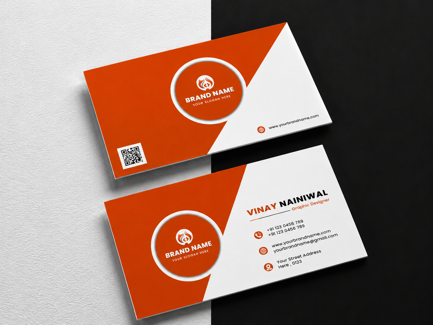
Brand Identity project cover

Overview

A modern identity system designed to create a strong and memorable brand presence across printed materials. The visual direction combines bold orange, clean white space, strong typography, and geometric forms to keep the identity consistent and recognizable.

Problem

The brand needed a stronger visual identity that could feel professional and distinctive across everyday print materials without becoming overly complicated.

Research

  • Explored bold colour combinations for a strong brand presence
  • Studied modern business card and identity layouts
  • Tested geometric compositions and visual hierarchy
  • Explored typography and spacing for clear brand communication

Design process

  1. 01

    Direction

    Defined a bold and modern visual direction using orange, white, and black as the core palette.

  2. 02

    Identity

    Developed a simple geometric visual language with a strong circular brand mark.

  3. 03

    Typography

    Selected clean, bold typography to create hierarchy across the identity.

  4. 04

    Print System

    Applied the identity across business cards and supporting print layouts.

Wireframes

The layouts were planned around a strong split composition, balancing the brand mark, typography, contact details, and supporting information.

Colour system

  • Orange

    #E04400

  • White

    #FFFFFF

  • Black

    #0B0B0B

  • Warm Grey

    #E8E8E8

Typography

  • Bold Sans Serif

    Strong weight for the brand name and primary communication

    Display
  • Clean Sans Serif

    Simple and readable for contact information

    Body
  • Clean Sans Serif

    Medium weight for supporting details and hierarchy

    Labels

UI components

  • Brand Mark
  • Business Card
  • Contact Card
  • Colour System
  • Typography System
  • Print Layout

Mockups

The final identity was presented through realistic business card mockups, highlighting the contrast between the orange, white, and black visual system.

Final result

A clean and distinctive brand identity that brings together bold colour, geometric structure, and clear typography across print applications.

Impact

  • 1

    Brand identity system

  • 2

    Business card layouts

  • 3

    Core brand colours

Lessons learned

A strong identity does not need to be complicated. Consistent colour, typography, and visual structure can create a clear and memorable brand presence.

Next project

Stay Home

Real Estate Marketing · 2026