CatDog
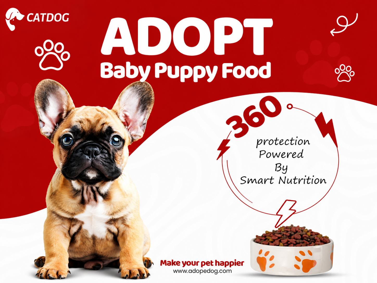
A bold pet-care campaign designed to communicate puppy nutrition through friendly visuals, clear messaging, and strong product-focused composition.
- Social Media
- Pet Care
- Digital Advertising
Overview
Problem
Research
- Explored visual directions commonly used in pet-care and pet-food advertising
- Studied how photography, typography, and product messaging can work together in a social creative
- Explored bold colour combinations to create a recognisable and energetic campaign direction
- Tested different approaches to visual hierarchy, balancing the puppy, headline, nutritional message, and product bowl
Design process
- 01
Visual Direction
Established a bold red-and-white visual language designed to feel energetic, friendly, and highly noticeable in a social media feed.
- 02
Composition
Built the composition around the puppy as the primary visual anchor, using the curved white section to separate the emotional imagery from the nutritional message.
- 03
Message Hierarchy
Prioritised the ADOPT headline and puppy-food message before introducing the supporting nutrition statement and product visual.
- 04
Final Creative
Refined typography, graphic accents, spacing, and supporting elements to create a cohesive promotional visual suitable for digital advertising.
Wireframes
Colour system
Primary Red
#D90000
Pure White
#FFFFFF
Deep Red
#A90000
Soft Grey
#F5F5F5
Typography
- Display
Bold Sans Serif
Heavy uppercase typography used for immediate attention and strong campaign hierarchy
- Supporting
Rounded Sans Serif
Friendly and approachable typography for secondary product messaging
- Information
Handwritten Script
Used selectively to soften the visual language and add a more personal pet-care feel
UI components
- Brand Logo
- Campaign Headline
- Puppy Hero Visual
- Nutrition Message
- Product Bowl
- Pet-care Graphic Elements
- Call-to-action Footer
Mockups
Final result
Impact
01
Hero campaign creative
03
Primary communication elements
01
Cohesive visual direction