Skip to content
All work
IKEA SingaporeProduct & UI2026

IKEA

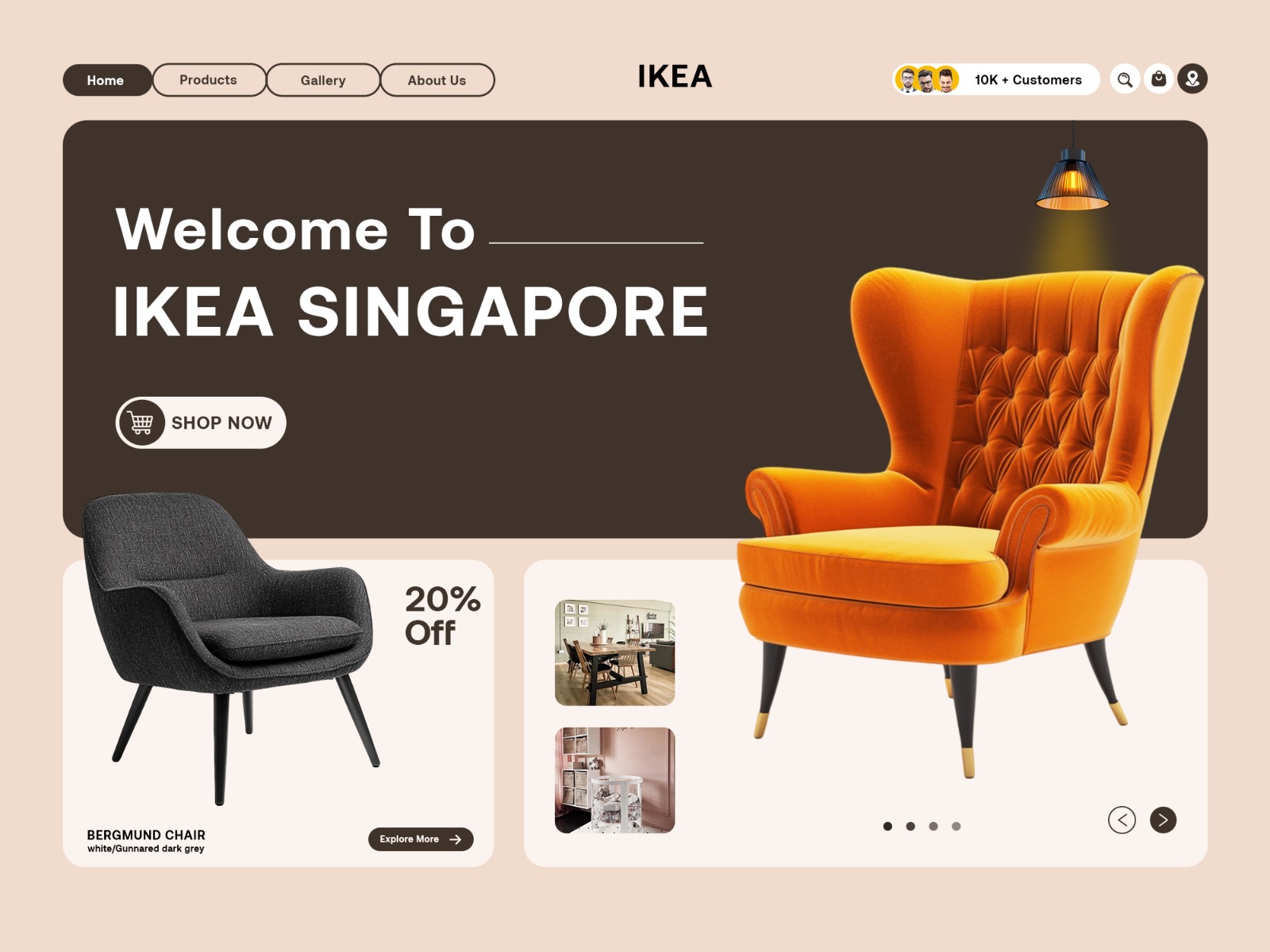
A warm, product-focused e-commerce interface designed to make IKEA Singapore feel approachable, visual, and easy to explore.

  • UI Design
  • E-commerce
  • Web Design
IKEA project cover

Overview

This IKEA website concept was designed around a warm and approachable shopping experience. The interface combines soft neutral tones, bold product imagery, rounded UI elements, and clear navigation to create a friendly e-commerce experience that keeps products at the centre.

Problem

The challenge was to create an e-commerce interface that feels visually engaging without making product discovery complicated. The design needed to balance strong product imagery with clear navigation, offers, and shopping actions.

Research

  • Studied modern furniture and home-commerce interfaces
  • Explored ways to make product discovery more visual and approachable
  • Compared navigation, product cards, and promotional layouts
  • Tested warm colour palettes and image-led compositions

Design process

  1. 01

    Direction

    Defined a warm, approachable visual direction inspired by modern furniture retail.

  2. 02

    Layout

    Structured the homepage around navigation, hero content, offers, and featured products.

  3. 03

    Visual System

    Built a consistent system of warm colours, rounded elements, typography, and product imagery.

  4. 04

    Final Interface

    Refined spacing, hierarchy, product placement, and shopping actions for the final layout.

Wireframes

The layout was planned around a clear shopping flow, giving navigation, featured products, offers, and key actions their own visual space before refining the final interface.

Colour system

  • Cream

    #F1DED0

  • Charcoal

    #44362F

  • Warm White

    #F8F1EC

  • Black

    #171412

Typography

  • Poppins

    Bold and clean for prominent headings and hero messaging

    Display
  • Poppins

    400/500 for clear and approachable interface copy

    Body
  • Poppins

    600 for navigation, product labels, and key actions

    Labels

UI components

  • Navigation Bar
  • Hero Section
  • Product Cards
  • Offer Cards
  • Category Navigation
  • CTA Buttons

Mockups

The interface was presented as a complete e-commerce homepage, combining product imagery, promotional content, navigation, and shopping actions into a cohesive visual experience.

Final result

A warm and engaging e-commerce interface that puts products first while keeping navigation, offers, and shopping actions clear and easy to follow.

Impact

  • 1

    E-commerce interface

  • 6

    Core UI components

  • 1

    Cohesive visual system

Lessons learned

Strong e-commerce design is about balance — the interface should attract attention while making it easy for users to discover products and take action.

Next project

CatDog

Social Media Campaign · 2026