Skip to content
All work
Cielo E-CommerceE-commerce Design2026

Vitamin C Serum

A premium Vitamin C serum campaign designed for a bright, fresh, and trustworthy e-commerce presence.

  • E-commerce
  • Product Design
  • Art Direction
Vitamin C Serum project cover

Overview

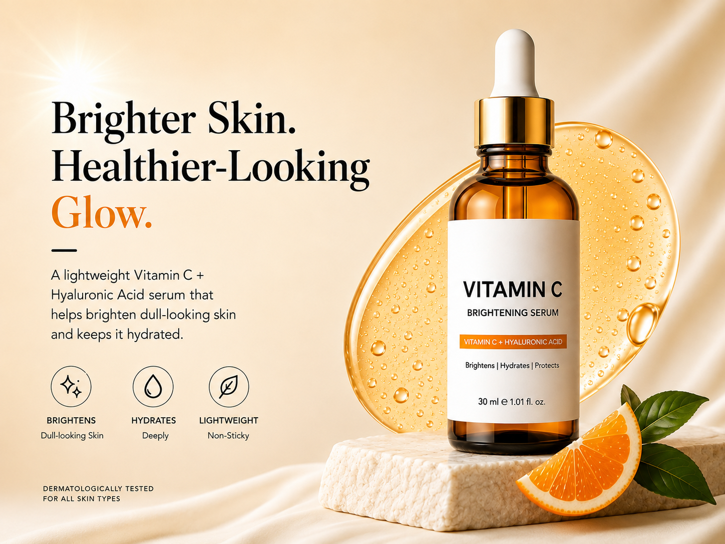
This Vitamin C skincare campaign was designed to make a brightening serum feel premium, fresh, and trustworthy in a crowded e-commerce space. We built the visual direction around warmth and radiance: an editorial typographic system, a soft cream palette, amber product tones, and carefully composed serum and citrus elements used across the hero creative.

Problem

The serum needed a stronger visual presence in a crowded skincare market. The challenge was to create a premium and fresh look while clearly communicating its key benefits without making the design feel overwhelming.

Research

  • Studied visual trends across premium skincare brands
  • Compared competitor Vitamin C serum creatives and layouts
  • Explored typography and colour directions for a fresh skincare feel
  • Tested product placement, lighting and ingredient-led compositions

Design process

  1. 01

    Concept

    Defined a bright, premium direction around Vitamin C and healthy-looking glow.

  2. 02

    Art Direction

    Explored product placement, serum textures, citrus elements and lighting.

  3. 03

    Visual System

    Built the typography, warm colour palette and benefit-led information hierarchy.

  4. 04

    Final Creative

    Refined the composition, product details and supporting elements for e-commerce use.

Wireframes

The layout was planned around a clear split between product and messaging. Early compositions focused on balancing the hero bottle, headline, benefits, and supporting visuals before refining the final creative.

Colour system

  • Cream

    #F7E7CF

  • Amber

    #C87516

  • Orange

    #F58220

  • Charcoal

    #171717

Typography

  • Playfair Display

    Large editorial serif for premium skincare headlines

    Display
  • Inter

    400/500 for clean and readable product copy

    Body
  • Inter

    600, uppercase with slight tracking for product details

    Labels

UI components

  • Hero Product Creative
  • Benefit Icons
  • Product Information
  • Ingredient Visuals
  • E-commerce Ad Layout
  • Typography System

Mockups

The final creative was presented in a premium product setting, using soft lighting, serum textures, and citrus elements to reinforce the skincare-focused visual direction.

Final result

A polished e-commerce creative that gives the serum a premium, fresh and trustworthy presence while keeping the product and its key benefits at the centre.

Impact

  • 1

    Hero creative developed

  • 3

    Key benefits highlighted

  • 1

    Cohesive visual direction

Lessons learned

A strong product visual does more than make the product look good — it creates a clear visual story around the product, its benefits, and the brand.

Next project

IKEA

Product & UI · 2026